Matryoshka Cornell box
Dusting off the future
Largeot
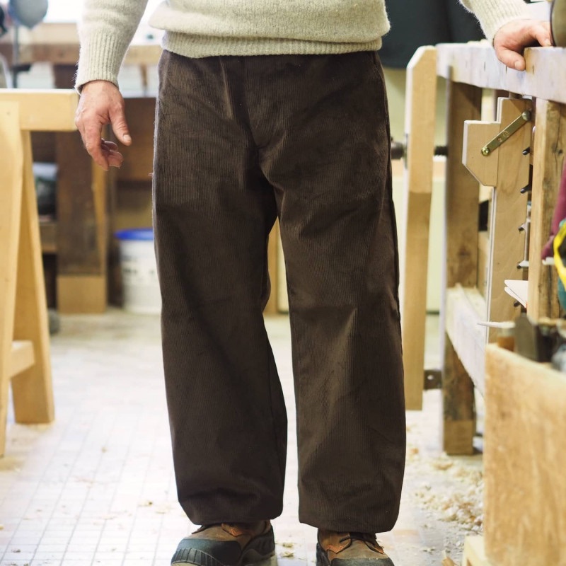
TIL: about French workwear pants
Animated Glitch SVGs
Not much control, but a good starting point
Glitcher